R function - heatmap.2
26 Dec 2015Heat map
Heat map is a kind of representation method that uses colors (always gradients) to represent the values in a matrix. It is very useful to detect valuable patterns in (large) data sets (with many variables) quickly. See Wikipedia for details.
Example in R using heatmap.2
There is an advanced function in package gplots, heatmap.2. It provides a number of extensions to make your heat maps more interesting and informational.
1
2
3
4
5
6
7
8
9
10
11
12
13
14
15
16
17
18
19
20
21
22
23
24
25
26
27
28
29
30
31
32
33
34
35
36
37
38
39
40
41
42
43
44
45
46
47
48
49
50
51
52
53
54
55
56
57
58
59
60
61
62
63
64
65
66
67
68
69
70
71
72
73
74
75
76
77
78
79
80
81
82
83
84
85
86
87
88
89
90
91
92
93
94
95
96
97
98
library(gplots)
library(RColorBrewer)
# Use the data frame "mtcars" as an example, and transform to a matrix
data(mtcars)
cars <- as.matrix(mtcars) # A matrix with row and column names;
# you can set names with the functions
# "rownames" and "colnames" for other data sets.
# Some pre-defined parameters will be used afterward
cols <- colorRampPalette(c("gray",
"yellow","red"))(100) # interpolate the given three colors
# to create new color palettes with 100 colors.
colCols <- ifelse(colnames(cars)>"m","purple",
ifelse(colnames(cars)>"f","lightblue","red")) # set colors for the column names arbitrary.
rowCols <- ifelse(rownames(cars)>"m","purple",
ifelse(rownames(cars)>"f","lightblue","red")) # set colors for the row names arbitrary.
# The main function, and comments for frequently-used arguments.
# See Fig. 1 for the representation.
heatmap.2(
cars, # a numeric matrix
Rowv=TRUE, # if and how the row dendrogram should be reordered,
# default value is TRUE.
Colv=TRUE, # if and how the column dendrogram should be reordered,
# always equal to "Rowv".
distfun=function(x)
{dist(x,method="manhattan")}, # function used to compute the distance between
# both rows and columns. The default is Euclidean distance,
# but you can change it (Notice, there is a function).
hclustfun=function(x)
{hclust(x,method="average")}, # function used to compute the hierarchical
# clustering when "Rowv" or "Colv" are not dendrograms.
dendrogram="both", # draw dendrogram(s) for "row", "column", or "both", or "none".
scale="column", # should normalize the values in "row" direction
# or the "column" direction, or neither ("none").
na.rm=TRUE, # whether the NAs should be removed.
col=cols, # colors for the image, many many options,
# search for the functions "colorRampPalette",
# "rainbow", "colorpanel", "brewer.pal" ...
# then improve your figures.
cellnote=ifelse(abs(scale(cars))>2,'Y','N') , # a matrix of character strings
# which will be placed in each cell.
# I check whether the absolute scaled values
# bigger than 2 (not very useful here).
notecex=0.8, # the size of "cellnote" (a scaling factor).
notecol="black", # color for "cellnote".
trace="column", # should a solid trace be drawn across "column",
# "row", "both" or "none".
tracecol="white", # color for the trace
margin=c(5,10), # margins for column and row names, respectively.
ColSideColors=colCols, # a vector of colors for the horizontal
# side bar used to annotate the columns.
RowSideColors=rowCols, # a vector of colors for the vertical
# side bar used to annotate the rows.
key=TRUE, # whether a color key should be shown.
keysize=1.2, # the size of the color key.
density.info="density", # whether to superimpose a "histogram",
# "density" or "none" on the color key.
denscol="black", # the color for the "density".
key.title="Color key", # main title of the color key. "NA" for no title.
key.xlab=NULL, # x label of the color key.
# "NULL" for automatic label which is
# related to the "density.info" you used.
key.ylab=NULL, # y label of the color key.
main="Heat map example", # main title.
xlab="Column names", # x axis title.
ylab="Row names" # y axis title.
)
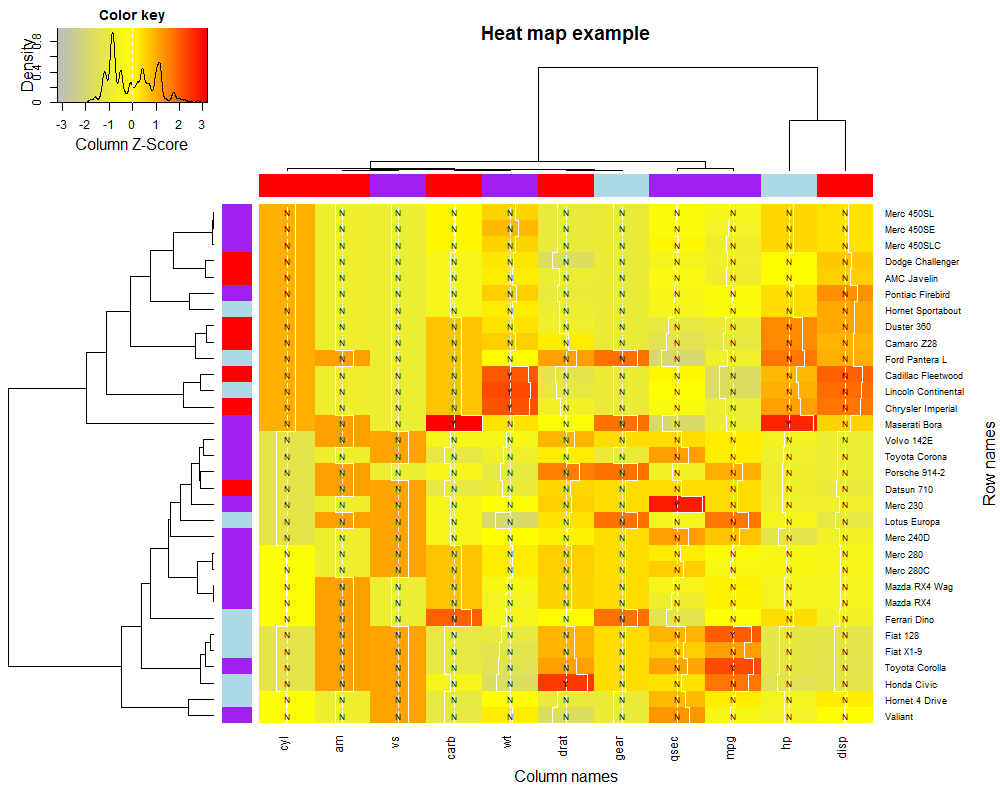 Figure 1 Heat map for data set mtcars.
There are more arguments, see the manual for more powerful operations. Be careful that some arguments are correlated, and you should try many times to draw a proper figure.